What you'll need to know...
KEY CONCEPT - Processes of population change and their effect on people and places
Population change and demographic transition over time, including natural increase, fertility rate, life expectancy, population structure and dependency ratios
• Detailed examples of two or more contrasting countries
The consequences of megacity growth for individuals and societies
• One case study of a contemporary megacity experiencing rapid growth
The causes and consequences of forced migration and internal displacement
• Detailed examples of two or more forced movements, to include environmental and political push factors, and consequences for people and places
Synthesis, evaluation and skills opportunities
How the impacts of population change and spatial interactions between places can be categorized and represented graphically
Demographic Transition over time...
Starter: Define the following terms:
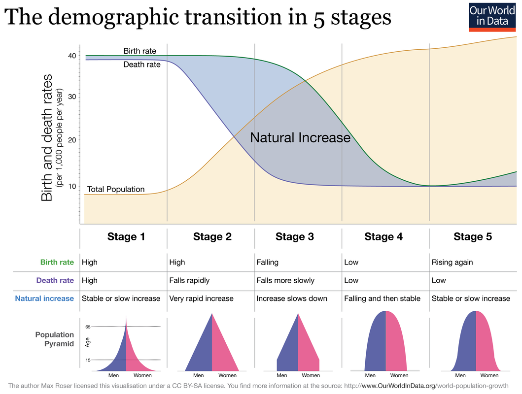
Demographic transition is best viewed through the lens of the now famous Demographic Transition Model, as shown below. This is essentially a line graph that plots birth and death rates over time & levels of economic development (stages). When birth rates are higher than death rates, population increases (shown in blue) and when birth rates dip under death rates, a population decline may take place. There are countries around the world who find themselves in four of the five stages and one might also see the pattern of economic development increasing (LIC-MIC-HIC) along the X axis too.
Task 1 - Complete the worksheet below using the DTM model and your previous knowledge of the causes and effects of disparities in economic development.
Rules: 7 lines of writing only per stage, size 8 font. Colour code as follows:
- Natural increase
- Fertility rate
- Life expectancy
- Population structure
Demographic transition is best viewed through the lens of the now famous Demographic Transition Model, as shown below. This is essentially a line graph that plots birth and death rates over time & levels of economic development (stages). When birth rates are higher than death rates, population increases (shown in blue) and when birth rates dip under death rates, a population decline may take place. There are countries around the world who find themselves in four of the five stages and one might also see the pattern of economic development increasing (LIC-MIC-HIC) along the X axis too.
Task 1 - Complete the worksheet below using the DTM model and your previous knowledge of the causes and effects of disparities in economic development.
Rules: 7 lines of writing only per stage, size 8 font. Colour code as follows:
- Natural Increase - Blue
- Fertility Rates - Green
- Life Expectancy - Orange
- Population Structure - Red
TOK consideration: Why can't the early stages of the DTM above be attributed to Australia and the USA?
|
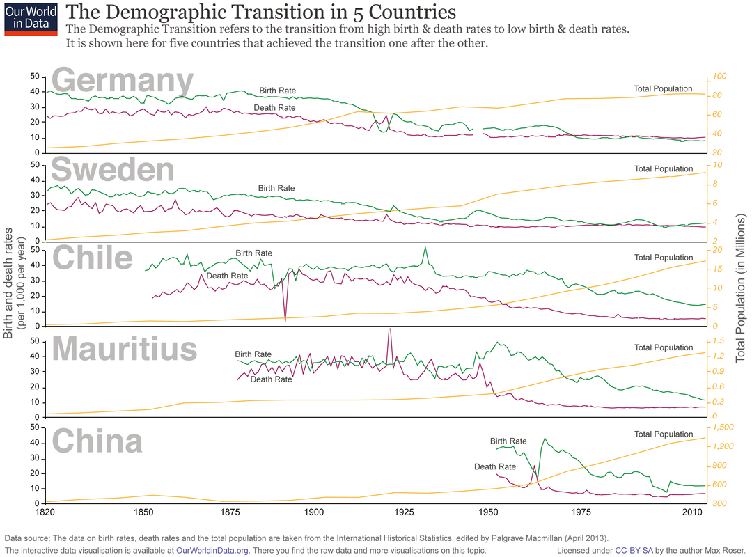
Study the graphic to the right carefully. You can click to enlarge it. The chart presents the empirical evidence for the demographic transition for five very different countries in Europe, Latin America, Africa, and Asia. In all countries we observed the pattern of the demographic transition, first a decline of mortality that starts the population boom and then a decline of fertility which brings the population boom to an end. The population boom is a temporary event. In the past the size of the population was stagnant because of high mortality, now country after country is moving into a world in which the population is stagnant or declining because of low fertility e.g. South Korea, Spain or Italy. |
|
Dependency Ratio
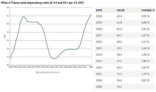
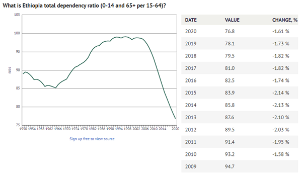
The total dependency ratio tells us the proportion of the population not in the work-force who are ‘dependent’ on those of working-age, it’s a calculation which groups those aged under 15 with those over 65 years as the ‘dependents’ and classifying those aged 15-64 years as the working-age population. It’s a simplistic calculation which is used across the world to understand societies and get a sense of potential pressures the economy may face in supporting an economically dependent population. (source)
TOK consideration: One of the obvious limitations of dependency ratios is the assumption that people under 15 years and over 65 years (65+) are outside of the labour force, as well as the assumption that those aged 15-64 are participating in the labour force. We all know that these assumptions are flawed.
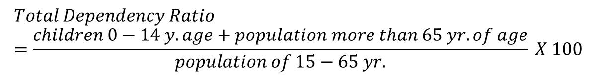
Definition Dependency Ratio: The average number of economically dependent population per 100 economically productive population, for a given country, territory, or geographic area, at a specific point in time.
Check out this Dependency Ratio league table from Wikipedia. Play around with the league placings to see total dependency, young dependency and elderly dependency and see where you home country is in the table.
Check out this Dependency Ratio league table from Wikipedia. Play around with the league placings to see total dependency, young dependency and elderly dependency and see where you home country is in the table.
Task 2 - Complete the worksheet using the interactive version of the map above.
The Contrasting Detailed Examples
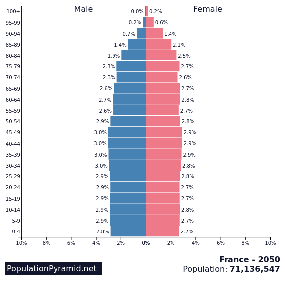
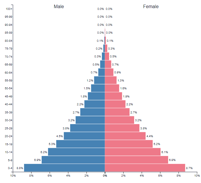
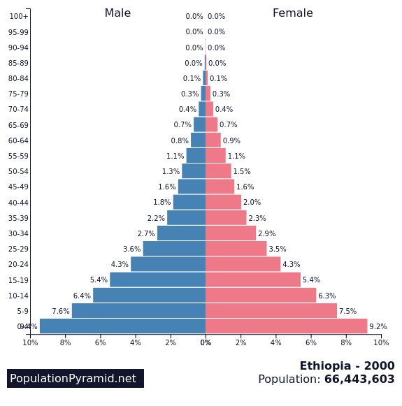
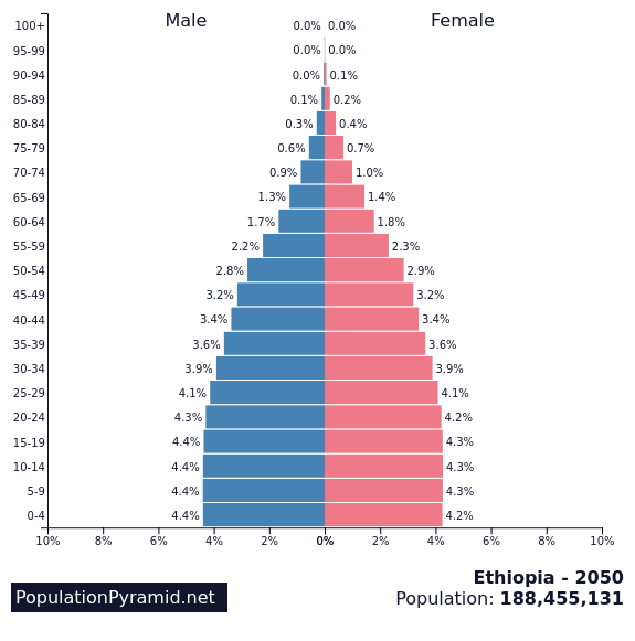
Task 3 - Using the graphics below and the worksheet below, describe the process of population change in both France and Ethiopia. Make reference to Natural Increase, Fertility Rates, Life Expectancy and Population Structure.
France
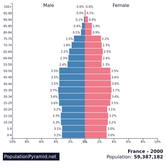
Population stucture of France 1960 - 2000 - 2050
Population Change in France - 1960-2022
Demographic Transition in France 1950-2020
Dependency Ratio - France 1950-2020
|
Ethiopia
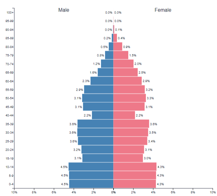
Population structure of Ethiopia 1960 - 2000 - 2050
Population Change in Ethiopia - 1960 -2022
Demographic Transition in Ethiopia 1950-2020
Dependency Ratio - Ethiopia 1950-2020
|
The consequences of megacity growth for individuals and societies...
Synthesis Time! - Create a mind map to show the consequences of megacity growth for individuals and societies using Mumbai, India ("Maximum City") as your focus case study.
Your first task is to find out why Mumbai is growing and this link from Internet Geography will help you out. This link to an article on 'Tutor Chase' will be of use for the section on the consequences of growth on people as well as the two videos below.
Your first task is to find out why Mumbai is growing and this link from Internet Geography will help you out. This link to an article on 'Tutor Chase' will be of use for the section on the consequences of growth on people as well as the two videos below.
|
|
|
The causes and consequences of forced migration and internal displacement...
|
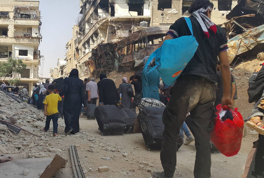
The International Association for the Study of Forced Migration (IASFM) defines it as "the movements of refugees and internally displaced people (those displaced by conflicts) as well as people displaced by natural or environmental disasters, chemical or nuclear disasters, famine, or development projects."
An internally displaced person (IDP) is someone who is forced to flee his or her home but who remains within his or her country's borders. They are often referred to as refugees, although they do not fall within the legal definitions of a refugee. Around the world, there are currently: People in refugee-like situation: 803,134 Refugees: 17.187 million IDPs: 36.627 million Asylum seekers: 2.826 million |

|
For this section of work, we are required to study two forced movements of people. Again, we are going to refer back to the core unit on Climate Vulnerability & Resilience and the work we did on climate refugees in Bangladesh. This is a forced movement of people caused by the rising sea levels and more intense typhoons (environmental factors but with a human cause). The work that we completed can be found at the bottom of this page.
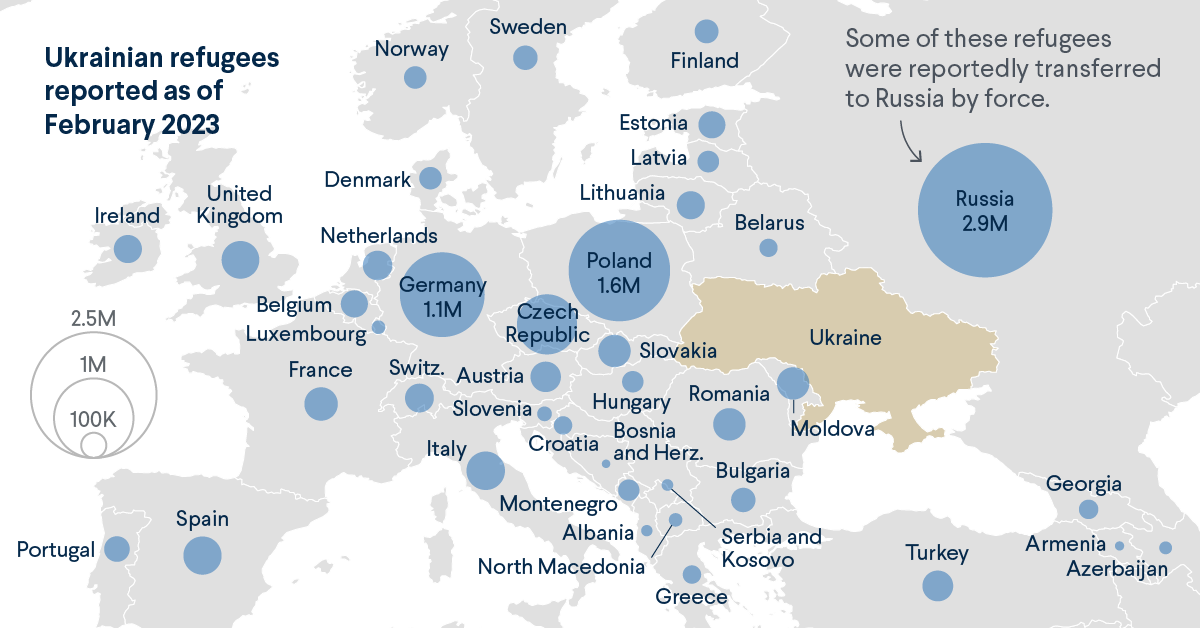
Our comparative case study will be the displacement of Ukrainian nationals following the Russian invasion of their country in February 2022. Your work should cover the following points:
Environmental push factors
Economic push factors
Political push factors
Consequences for Ukrainian people and both the country of Ukraine.
Use this link as well as the resources below as well as the map embedded in your case study.
|
|
|
|