
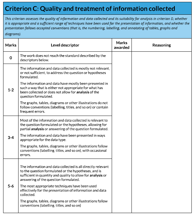
Treatment of information collected...
6 marks available - a lot of these marks are for actions and not words!
Suggested word count of 500 out of the 2500 words. *However, you may not use many words in this section and so can carry them over to Step 4.
Deadline First Draft: Monday 28th June (**For Step 3 & 4**).
Suggested word count of 500 out of the 2500 words. *However, you may not use many words in this section and so can carry them over to Step 4.
Deadline First Draft: Monday 28th June (**For Step 3 & 4**).
|
The presentation of your data (graphs etc) and the written analysis must be integrated - no random graphs on a single page.
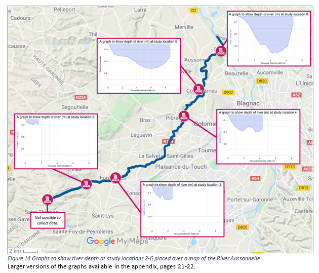
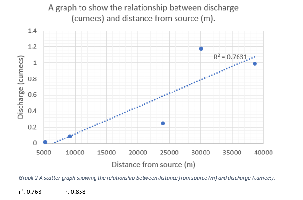
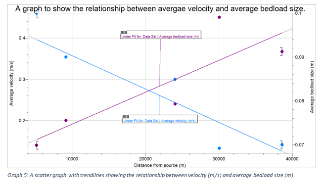
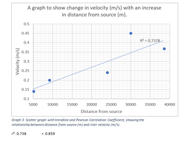
You should treat and display the data collected using the most appropriate techniques. The "most appropriate techniques" are: - the most effective - well used - good quality presentation The presentation of results could involve processes such as: - Cross sectional diagrams and graphs - here is a useful calculator for you. - Graphs to show bed load size - Scatter graphs to show the relationship between wetted perimeter and velocity - Scatter graphs to show how discharge changes with the distance from the source - Annotated diagrams/photographs of each site, including the human activity - Sketch of the long profile of the river Some important points to remember. * All measurements should be in metres * If you are investigating changes downstream, your x-axis should always be distance from source in metres. * If you are creating your own cross section graphs for each site, the x-axis should be the 10 interval distances across the channel e.g. if the occupied channel width was 2.4 metres, each x-axis point should be plotted at 0.24m. Scale on the x axis should not change for each site. You should consider including a statistical test that includes confidence limits. A member of the Maths department or a willing IB DP Maths students will lead a session explaining this. A suggested use of a statistical test would be to quantify the strength of relationship distance from source and one of the sets of data you collected. Here is a worked example. You will need to work out the river velocity from the data you have collected. Here is the calculation Discharge (m3/s) = Cross sectional area (m2) × Velocity (m/s) Cross sectional area (m2) = Width (m) × Mean depth (m) |
|
Make sure you do the following...
- Use the most appropriate methods - just using Excel or Google Sheets to produce graphs may not be the most appropriate method!
- Include a statistical test.
- All the axis are correctly and clearly labeled.
- Use the most appropriate methods - just using Excel or Google Sheets to produce graphs may not be the most appropriate method!
- Include a statistical test.
- All the axis are correctly and clearly labeled.
What the examiner is going to use...
Source: Geographyalltheway